Create and manage your pages.
Learn the basics and get more detailed explanations of Sites' features
Create a page
6 mins, 23 secs
Using the Pagebuilder, learn how to create pages, add text, images and widgets all with just three different block types. 
Learn the basics of Pages with step by step illustrated guides.
Communico Sites allows you to create and manage multiple sites from within the control panel
Create startpages, desktop pages and whole websites
Build headers and footers
Set themes that can be applied to whole sites or individual pages
Create pages
Build up your site’s navigation by adding pages and linking to your other modules
Your site will be built up of individual pages, which are easily created within the control panel, and then linked from your site navigation
All your pages will appear under the Pages tab in the Sites section of the control panel.
You can select any existing page from the list, and edit or delete it. There’s a search field at the top of the list, where you can search by page name or description to find a specific page more easily.
Navigate to the Sites section of the control panel.
You’ll find a list of all your sites that have already been created. Select the site you want to create a page for. Select the Pages tab to find a list of all of the pages that have already been created within that site.
To create a new page, click New page
Give the new page a title and a short description, so that it’s easy to identify and find in the listing later on. The new page will automatically show any default header and footer that are assigned to the site.
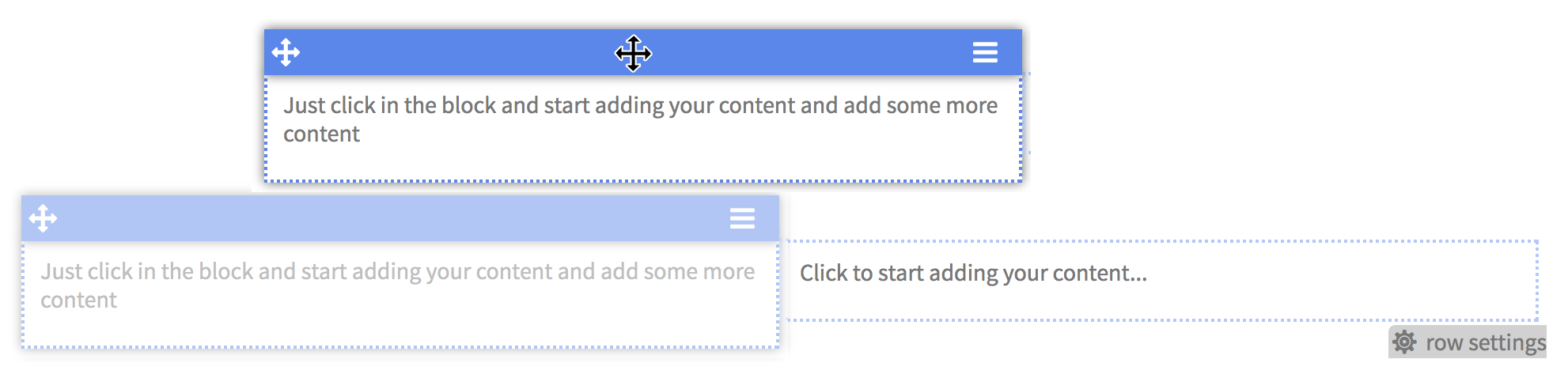
A content block with dummy text will also appear, just to get you started. You’ll build up your page by dragging and dropping page blocks from the side menu, and populating them with content.


Add content blocks and widget blocks to your pages to create the layout for each page. You can also nest content blocks and widgets within container blocks, to enable you to create more complex layouts. With just these three block types, you can create totally individual and flexible layouts for your pages. Just drag and drop the blocks into place on your page from the side menu on the right.
Page blocks are color coded to make them easy to identify when editing your pages
Containers are pink
Content blocks are blue
Widget blocks are green
To help you see how a page is structured, check the Show layout option in the right hand menu. This will reveal the color coded block edges and create some extra space around each block to help with moving and repositioning.
This is a really useful feature when building up your page, using containers, or repositioning your content.
You can uncheck the Show layout option anytime to go back to an accurate preview of your page.

Content blocks are blue
Content blocks can be added from the block palette located in the menu on the right of the browser.
Click and drag the blue content block icon onto your page, where you want the content block to appear.
A solid black line will appear to show where the block can be positioned.

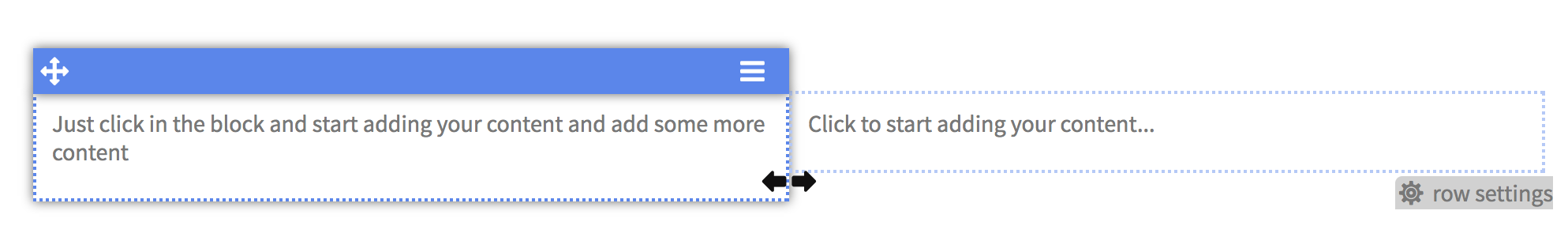
Drag the blue header bar of the content block and then release it in the new position. A solid black line will appear whenever you hover over a position where the block can be placed, so use this as a guide.
Hover over the right edge of a content block and if it can be resized a double arrow will appear. Click and drag to your desired width and the block will snap to the closest grid position that fits. You can use an empty container block to create some blank space on the page, which gives a little more flexibility for your layouts.
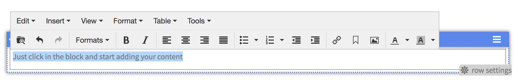
To add text, select a content block, and click inside to start typing. A text editor will appear, allowing you to add your own text. You can also paste in copied text, but any formatting it has will be stripped out. Text can be styled using the built in formatting options in the toolbar. Based on your themes, you can select headings, text styles, set alignments etc.
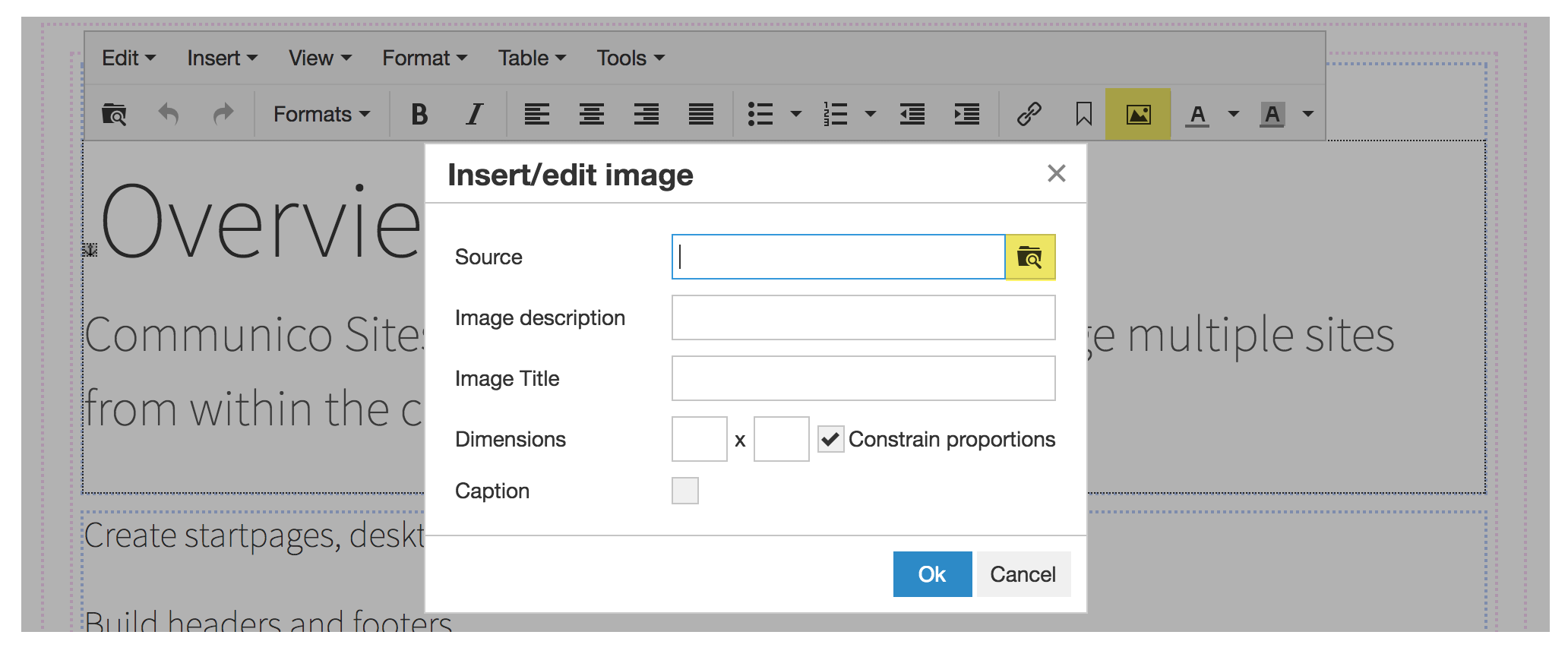
To add an image, select a content block, and click inside to place your cursor where you want the image to appear.
On the text editor toolbar, click the insert image icon. On the pop up, click the Source icon, which will take you to the Media Manager.
Either select an image you have already uploaded, or click Upload, then Local machine, to browse your computer and select a file to upload.
Note: Make sure that the images you upload are of a suitable size and resolution. If not, performance of your site could be affected and pages will be slow to load. Images are made up of pixels, and the more pixels, the larger the file size will be. You need to use images suitable for screen display on your website. An image 1200px wide at 72 dpi will generally be crisp enough to display on your pages. Images with higher resolutions and larger sizes will look the same, but will take longer to load.
You can easily change the size of an image you have uploaded if it is too large. This can be done within the Media Manager.
Select Media in the control panel side navigation.
Upload your image, or find it in the Media Manager.
Select your image, and click Manage.
Select Edit in the dropdown
Here you can change the size of the image, and make any additional edits, including cropping, adjusting color and contrast, adding filters, etc.
Apply your changes and save. When you save, you can choose to either overwrite your image with the changes, or create a copy of it with a new name.

You can add spacing, set background colors and effects, and customize your container, content and widget blocks.
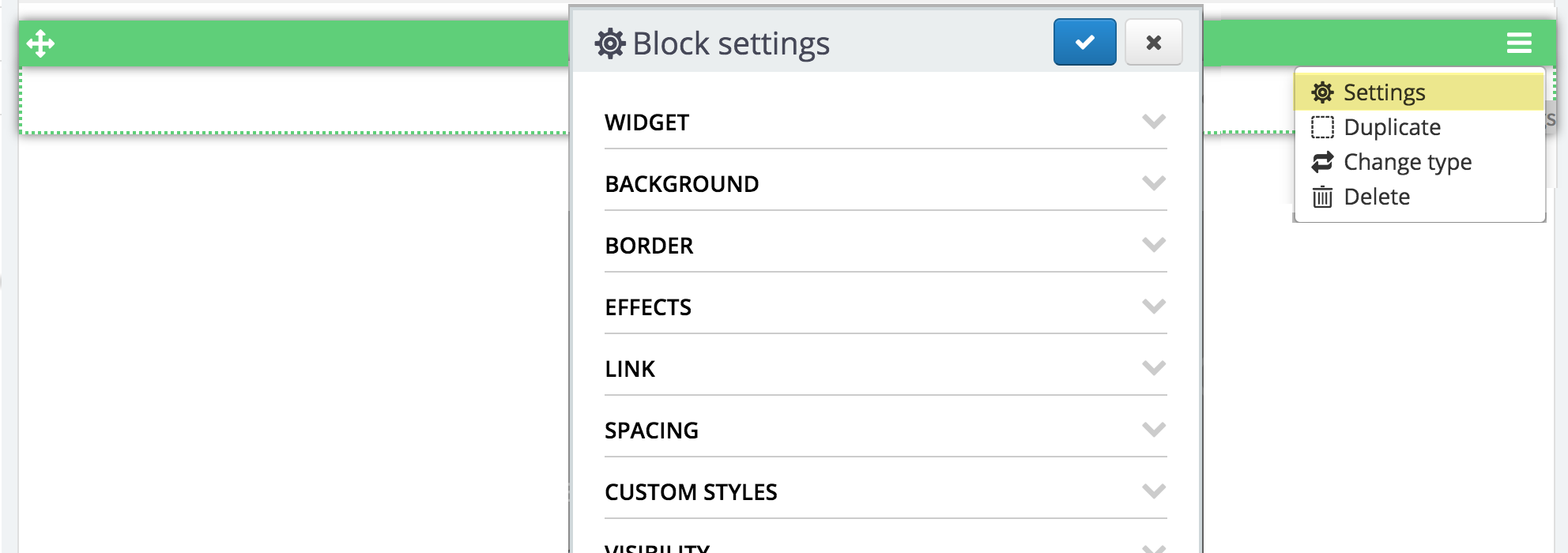
Hover over the content block and click on the menu icon on the right of the block’s header strip. Select Settings from the dropdown.
You can define custom settings for individual content blocks, changing the way a block looks.
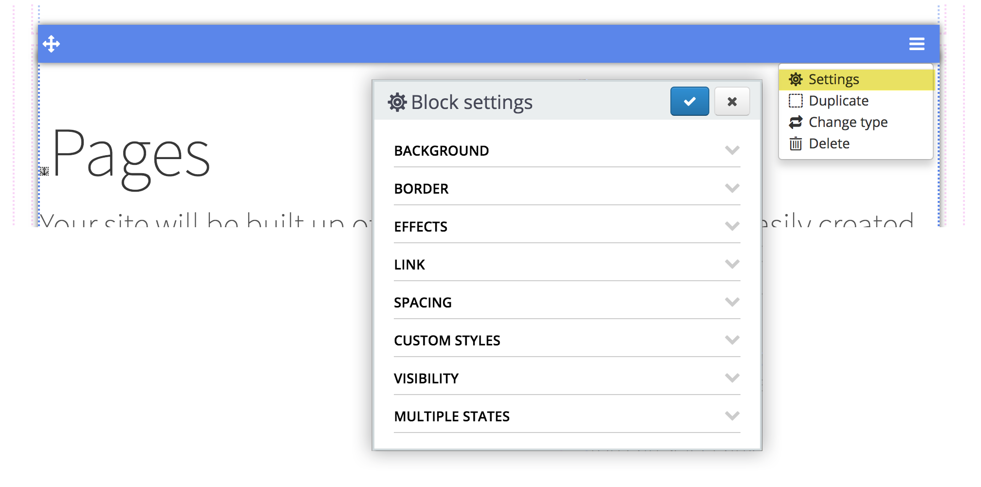
Color - Select a background color for the block
Background image - Upload or select a background image for the block
Background size - Set the size of your background image. Stretch to fit, cover, contain or no sizing.
Background repeat - Set the repeat pattern if your background image repeats. Repeat will tile the area, or you can select repeat x which will repeat the image in a horizontal row, or repeat y which will repeat the image in a vertical column.
Shadow offset x - Set how far left or right to offset the shadow
Shadow offset y - Set how far up or down to offset the shadow
Shadow size - Set how sharp or diffuse to make the shadow
Shadow spread - Set how wide to spread the shadow
Shadow color - Select the color of the shadow
Shadow opacity - Set the opacity of the shadow
Link URL - Enter a URL here to turn the entire block into a link
Custom styles - Select one of your listed custom styles to apply to the block
You can choose to hide this block on screens of a certain size, by switching the toggle to hide for mobiles, tablets, small desktops or large desktops.
Color - Select a border color for the block
Width - Set a width for the entire border
Top - Set a width for the top border only
Left - Set a width for the left border only
Bottom - Set a width for the bottom border only
Right - Set a width for the right border only
Style - Choose a line style for the border. It can be solid, dotted or dashed
Radius - Set how much to round the corners of the block
Padding - Set the amount of empty padding to appear around your content inside the block
Padding top - Set the amount of padding above your content
Padding left - Set the amount of padding to the left of your content
Padding bottom - Set the amount of padding below your content
Padding right - Set the amount of padding to the right of your content
Margin - Set the amount of empty margin to appear around the outside of the block
Margin top - Set the amount of margin above the block
Margin left - Set the amount of margin to the left of the block
Margin bottom - Set the amount of margin below the block
Margin right - Set the amount of margin to the right of the block
Hover state - Toggle to enable hover states, then you can build up another version of the block to appear on hover. To build up multiple states, switch between the normal and hover tabs on the blue header strip, visible when you hover over the block.
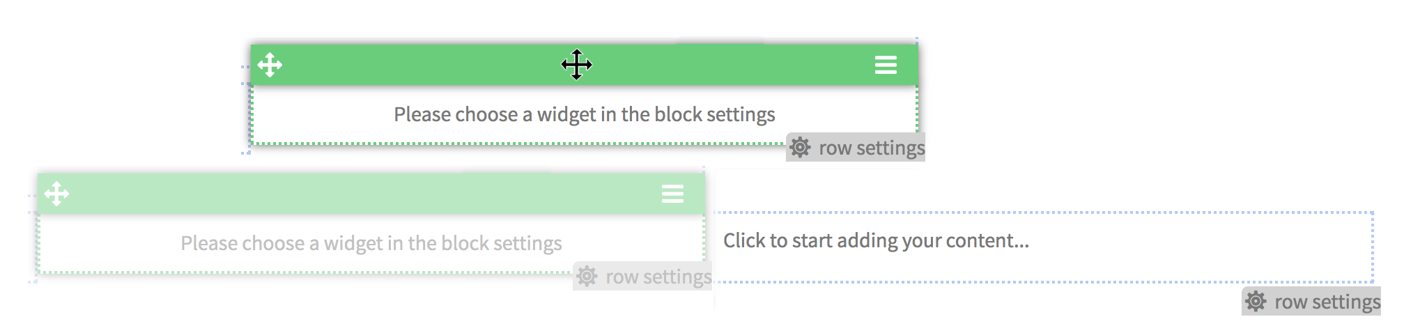
Widget blocks are green
Once you have created a widget, it can be added to any of your pages. They will need to be held inside a widget block.
Widget blocks can be added from the block palette located in the menu on the right of the browser.
Click and drag the green widget block icon onto your page, where you want the widget to appear.
A solid black line will appear to show where the block can be positioned.

Drag the green header bar of the content block and then release it in the new position.
A solid black line will appear whenever you hover over a position where the block can be placed, so use this as a guide.
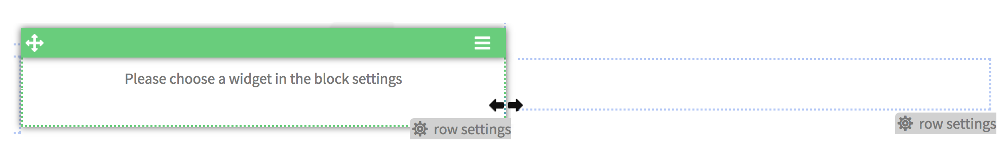
Hover over the right edge of a widget block and if it can be resized a double arrow will appear.
Click and drag to your desired width and the block will snap to the closest grid position that fits.
You can use an empty container block to create some blank space on the page, which gives a little more flexibility for your layouts.
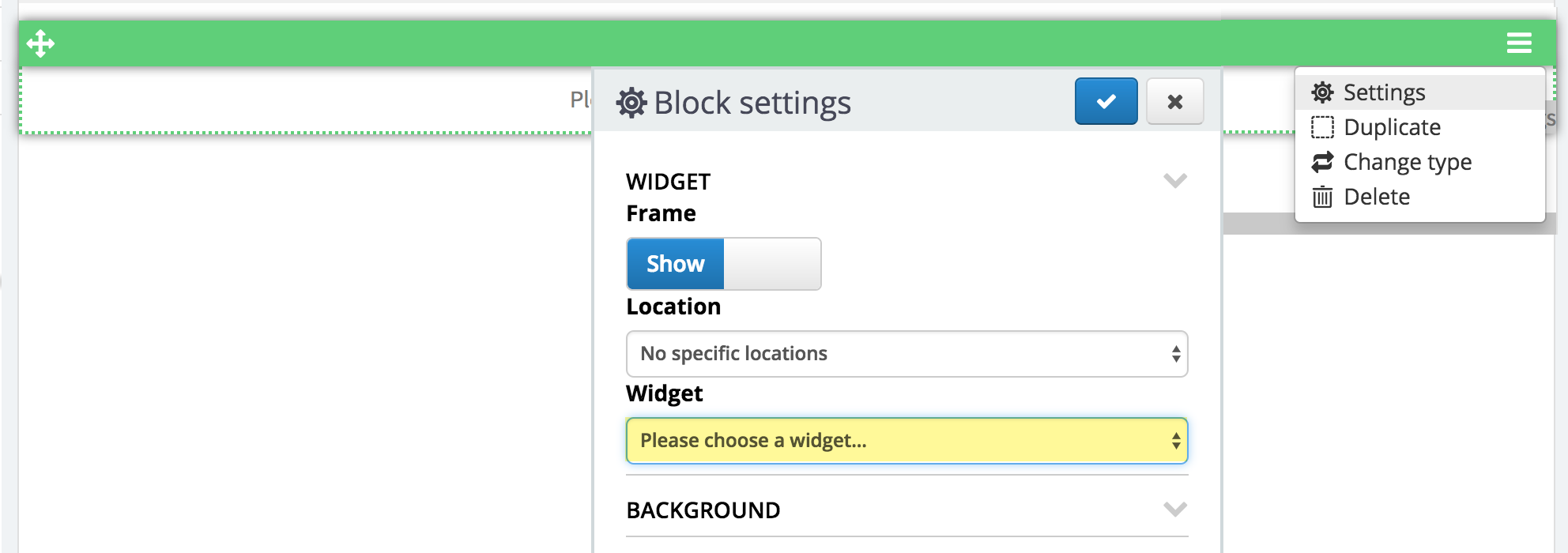
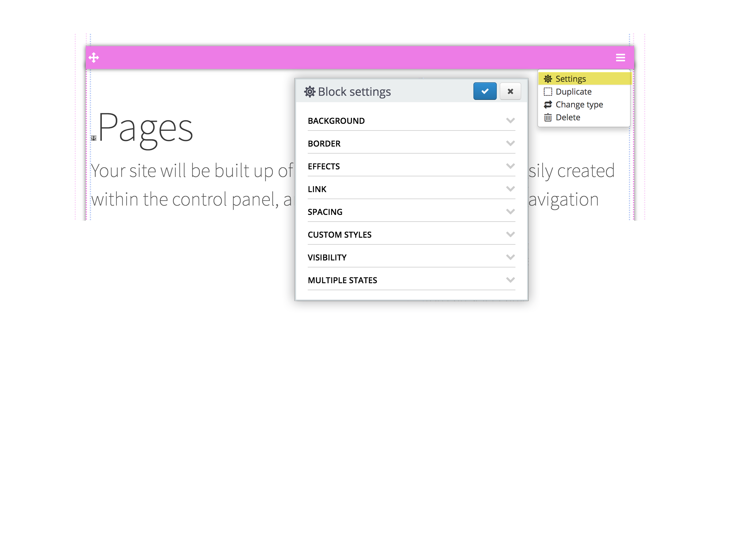
Hover over the widget block and click on the menu icon on the right of the block’s header strip.
Select Settings from the dropdown.
Under the Widget section, use the Widget dropdown to select your widget from the list of those available.
When you add widgets to your pages, they will take on the styles that have been set in the theme for your site. You can use the block settings to add spacing and effects, and overwrite background colors and borders.
Hover over the widget block and click on the menu icon on the right of the blocks header strip.
Select Settings from the dropdown.
You can define custom settings for individual widget blocks, changing the way the widget looks.
Frame - Select whether to show or hide the frame with the widget name
Widget - Select your chosen widget from the dropdown list
Location - If this widget displays information specific to a particular library location, select that location from the dropdown list
Color - Select a background color for the block
Background image - Upload or select a background image for the block
Background size - Set the size of your background image. Stretch to fit, cover, contain or no sizing.
Background repeat - Set the repeat pattern if your background image repeats. Repeat will tile the area, or you can select repeat x which will repeat the image in a horizontal row, or repeat y which will repeat the image in a vertical column.
Color - Select a border color for the block
Width - Set a width for the entire border
Top - Set a width for the top border only
Left - Set a width for the left border only
Bottom - Set a width for the bottom border only
Right - Set a width for the right border only
Style - Choose a line style for the border. It can be solid, dotted or dashed
Radius - Set how much to round the corners of the block
Link URL - Enter a URL here to turn the entire block into a link
Custom styles - Select one of your listed custom styles to apply to the block
Padding - Set the amount of empty padding to appear around your content inside the block
Padding top - Set the amount of padding above your content
Padding left - Set the amount of padding to the left of your content
Padding bottom - Set the amount of padding below your content
Padding right - Set the amount of padding to the right of your content
Margin - Set the amount of empty margin to appear around the outside of the block
Margin top - Set the amount of margin above the block
Margin left - Set the amount of margin to the left of the block
Margin bottom - Set the amount of margin below the block
Margin right - Set the amount of margin to the right of the block
Shadow offset x - Set how far left or right to offset the shadow
Shadow offset y - Set how far up or down to offset the shadow
Shadow size - Set how sharp or diffuse to make the shadow
Shadow spread - Set how wide to spread the shadow
Shadow color - Select the color of the shadow
Shadow opacity - Set the opacity of the shadow
You can choose to hide this block on screens of a certain size, by switching the toggle to hide for mobiles, tablets, small desktops or large desktops.
Hover state - Toggle to enable hover states, then you can build up another version of the block to appear on hover. To build up multiple states, switch between the normal and hover tabs on the blue header strip, visible when you hover over the block.
Container blocks are added in the same way as content and widget blocks.
From the block palette on the right of your browser, click and drag the pink container icon onto your page where you would like to place the container.
A solid black line will appear to show where the block can be positioned.
You can then drag content blocks, widget blocks, and other container blocks into the container.
Containers are ideal for creating columns on your page, or grouping together multiple blocks. Blank containers can be used to create horizontal blank space on your page.
Using the Show layout option will make using containers much easier, as the dotted block outlines will show exactly where your blocks are located, and which blocks sit within a container.

Containers can also be styled and adjusted using the block settings.
Hover over the container block and click on the menu icon on the right of the blocks header strip.
Select Settings from the dropdown.
Container blocks have the same settings available as Content blocks.
Pages, headers and footers will naturally assume a maximum width of 988px, but can also be set to full width.
Only the outer block will take on the full-width setting if applied. Any blocks nested within an outer container block will be constrained to the page width.
Hover over the bottom right corner of the block to reveal the row settings.
Open the row settings and set the size to full width. You can set the background color for the full width background here.
Note: You will need to make sure your theme allows for full width. Under Themes, select your theme and select the Site width tab. Max width (for your content) and max row width can be restricted individually for the header, page body and footer. To allow for a full width header or footer, set the Max row width to none, but keep the Max width constrained to 988px (this will make sure your actual content remains at an appropriate width).


