Create a diverse range of widgets to pull data from your Communico modules, as well as external sources. Use these widgets to populate your pages, shows and apps.
Learn the basics and get more detailed explanations of the various Widget types
Widget Overview
2 mins, 42 secs
Get a snapshot view of many of our available widgets, and ideas on how you might use these across your sites and digital signage.
Create Events widgets
2 mins, 12 secs
Learn how to create Events widgets to display live data from Communico Attend, or another calendering system.
Create Form widgets
2 mins, 24 secs
Learn how to create a Form widget to facilitate contact and collect information from your website visitors.
Create HTML widgets
45 secs
Learn how to create HTML widgets, where you can use code to build up your own content, housed within a handy, reusable widget.
Create Locations widgets
2 mins, 36 secs
Learn how to create a Locations widget, to display the branch location related data held within Communico.
Create Online Resources widgets
2 mins, 3 secs
Learn how to create an Online Resources widget, to display a categorized directory of your available online resources.
Create Recommended Reads widgets
2 mins, 48 secs
Learn how to create a Recommended Reads widget, to connect your patrons with featured content from your ILS, via a dynamic, scrollable carousel.
Create Reserve widgets
1 mins, 32 secs
Learn how to create a Reserve widget, which pulls a live, filterable feed of the day's room bookings from Communico Reserve.
Create Slideshow Plus widgets
2 mins, 24 secs
Learn how to create a Slideshow Plus widget, to easily build and maintain dynamic, scrollable slideshows for your sites.
Learn the basics of Widgets with step by step illustrated guides.
Widgets are reusable, moveable items designed to show a wide range of content, responsively and dynamically. There are many different types built into Communico, each designed with a specific purpose.
They can be easily added to your sites, shows and apps, and can also be exported and embedded into external sites.
Most widget types are pre-styled, according to your themes, so it's very quick and easy to add them to your pages and shows, and you can then set any additional display options at that point.
Once created, the same widget can be used as many times as needed, across the various different platforms. This reusable quality makes building up your sites, shows, etc even easier, as you won't need to recreate these items every time you want to use them.
This also means that you only need to update the data once, at the source, and these changes will instantly be reflected in any live widgets.
Some widget types display content from the Control Panel or other Communico modules. This includes Events and Reserve widgets, as well as Location widgets, as all your branch information is stored in the Control Panel.
Other widgets display feeds from external sources. This includes Recommended Reads from your ILS, as well as Facebook, Twitter, and RSS feeds.
Or you can create your own content within pre-styled widgets - Forms, Buttons, Bookmarks for useful sites, or you can create an HTML widget that you code yourself.
Navigate to the Widgets section of the control panel.
You’ll find a list of all your widgets that have already been created.
To create a new widget, click New widget

Give the new widget a title and a short description, so that it’s easy to identify and find in the listing later on. Select the type of widget you want to create from the Widget type dropdown list.
The next steps will vary depending on the widget type, so continue to fill out the page, entering all the data required to build out this type of widget, and remember to save any changes you have made.

Different widget types are built up in different ways, so the page will look different, and you'll need to enter different information, depending which type you picked from the list.
When building up a widget, you'll use the Widget content tab to enter the data, and the Widget preview tab to see how the widget will look. You can apply different settings to the preview to see how most widgets will look at different locations, or with different themes applied.
Here you can find user guides for creating some of our more popular widget types:
Carousel widget
Events widget
Form widget
HTML widget
Locations widget
Online Resources widget
Recommended Reads widget
Reserve widget

Build up the carousel by adding cards. Click New Carousel Item to create a new card.
Card color - Enter the hex code or use the color picker to select a background color for the card.
Text color - Enter the hex code or use the color picker to select a text color for any text to add to the card.
Image - Upload an image from your computer, or select from the dropdown list if the image has already been uploaded to your Media Folder. The image will align to the top left of the card.
Card text - Enter a brief piece of text. This text will align to the bottom right of the card.
Link - Enter a URL. Clicking anywhere on the card will link to this URL.
Feed type - Select Communico if you use Attend for your events, or Evanced to pull a feed from there.
Display style - Select List to display your events in a list, or Calendar to include a calendar style date picker above the list.
Day range- Select the number of days' events to list out, from one to ninety.
Limit to tags - (optional) Select certain event types to which to limit the events in this feed.
Limit to ages - (optional) Select certain age groups to which to limit the events in this feed.
Show description - Check the box to include the short description for each event.
All locations - Check the box to disregard the location in which the widget is being display, and show events for all locations.
Featured events only - (optional) Check the box to limit this feed to featured events. Events can be marked as 'Featured' on the event creation page, assuming the user has permission to do so.
Truncate description - If you have opted to show the event descriptions, here you can choose a character limit at which to cut them off.
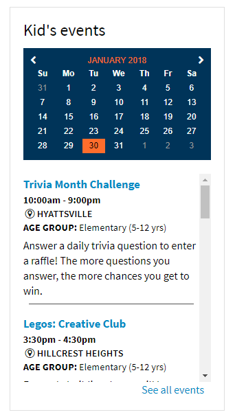
Full width calendar - If you have chosen a calendar style feed, check this box to make the widget title and date site above the calendar, rather than alongside it.
Limit for Broadcast - Select a limit to the number of events that will scroll through if you place this widget in a Broadcast show.
Events per page - Select a limit to the number of events that will show per scene if you place this widget in a Broadcast show.
Introduction text - (optional) Add some text to appear at the top of the widget.
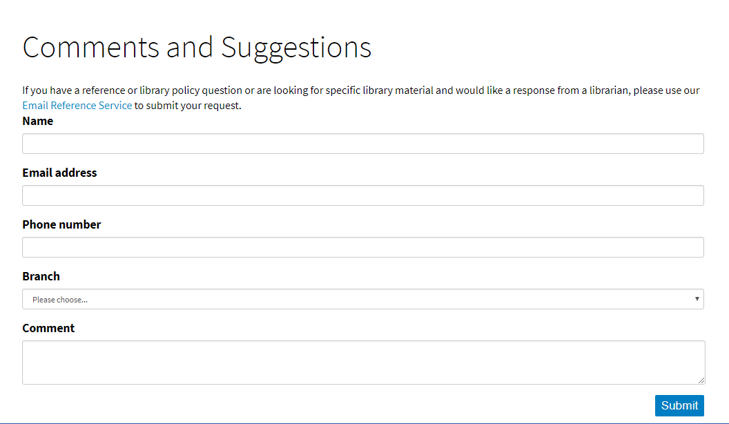
Email address - Enter the email address to which you would like the form entries to be sent when they are submitted.
Use CAPTCHA - Check the box to enable a CAPTCHA test to prevent non-human form submissions.
Submit button text - Enter the text that will appear on the 'submit' button. The default label is 'Submit'.
Form sent text - Enter the text that will appear in a popup to confirm that the form has been successfully submitted. The default message is 'Thank you'.
New custom field - Use this button to add a new field to the form. Select the field type from the dropdown that appears.
Text input - This will produce a small text field.
Field name - Enter the label or question text for this field.
Field placeholder - (optional) Enter placeholder text to occupy the field before it's filled out.
Help text - (optional) Enter help text to appear alongside the field.
Required - Check the box to make this a mandatory field - the form can not be submitted until this field is filled out.
Select from list - This will produce a picklist field.
Field name - Enter the label or question text for this field.
Help text - (optional) Enter help text to appear alongside the field.
Required - Check the box to make this a mandatory field - the form can not be submitted until this field is filled out.
Field options - Enter the options that will populate the picklist. Enter each item on a new line to create separate options.
Text area - This will produce a large, expandable text field.
Field name - Enter the label or question text for this field.
Field placeholder - (optional) Enter placeholder text to occupy the field before it's filled out.
Help text - (optional) Enter help text to appear alongside the field.
Required - Check the box to make this a mandatory field - the form can not be submitted until this field is filled out.
Checkbox - This will produce a checkbox field.
Field name - Enter the label or question text for this field.
Help text - (optional) Enter help text to appear alongside the field.
Required - Check the box to make this a mandatory field - the form can not be submitted unless this box is checked.
In the menu at the top of the text editor, select Tools, then Source code.
Add your code, and click Ok to confirm.

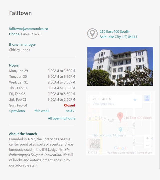
The Locations widget allows you to display data about your branch locations. Using location-aware pages, or setting the location of the widget, will mean that whether you have a single branch, or multiple locations, you'll create one widget, and each widget will display the information for only the relevant branch.
Location widgets are very customisable, so you can create several that each show different information, and then use them individually or group them together on a page.
The data for branch information is maintained and stored within the Control Panel, under Branches. Here, administrators will be able to update branch descriptions, contact details, links, images, and opening hours and holidays. This data will then populate the widgets, and when updated, will update live across all those widgets.
Introduction text - (optional) Add some text to appear at the top of the widget.
Title position - Select whether to hide the location name (title), or position it above, below or beside the branch image.
Image position - Select whether to hide the branch image, or position it left, right, or center aligned.
Current time - Check the box to include a display of the current time, for reference.
Today's hours - Check the box to include today's opening hours for the branch.
Tomorrow's hours - Check the box to include the following day's opening hours for the branch.
This week's hours - Check the box to show the weekly opening hours for the branch, including any special closures or holiday hours that have been recorded in the Control Panel.
Show description link - Check the box to include an 'About this branch' link, which will open a popup containing your branch description.
Show description inline - Check the box to include your 'About this branch' description text inline.
All hours - Check the box to include an 'All opening hours' link, which will open a popup containing your full opening hours and closure schedule, in a scrollable weekly format.
Other branches - Check the box to include a 'View all other branches' link, which will open a popup containing a list of branch names which have an 'About URL' set up. This 'About URL' is set up under Branches in the Control Panel, and if there's no URL set up, the Other Branches link won't appear.
Map - Check the box to include a 'Map' button, which will link to a popup containing a Google Map with your branch location pinned.
Manager - Check the box to show the branch manager's name.
Address - Check the box to show the branch address.
Telephone - Check the box to show the branch telephone number.
Fax - Check the box to show the branch fax number.
Email - Check the box to show the branch email address.
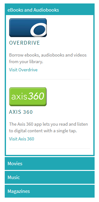
The Online Resources widget forms a complete categorized directory of the online resources your library offers. Each item can include an image with a link, a brief text description and a text link.
This widget can be used across websites and mobile apps.
Note. When configuring your Engage mobile app, you can request 'flat' styling for your online resources, meaning there are no buttons, and all items are listed vertically on the page under their section heading.
Introduction text - (optional) Add some text to appear at the top of the widget.
Display style - This option will only apply when the widget is placed on a website, as the mobile app uses fixed styling. Accordion style means the sections will open out by dropping down vertically. Popup style means that clicking a section heading will open a popup containing the items from that section, broken into the number of columms specified.
All items must sit within a parent section, so you must create at least one section before you can start adding items.
To create a section, click New Section.
Section title - Name this section. This name will appear as the button label or section heading.
Inline display style - This field is only relevant in newer versions of the Engage app. In those versions, you are able to embed the items directly onto the page, and this setting will determine whether they will be listed vertically down the page, or horizontally across the page.
To create an item, click New Item.
Parent section - Select the appropriate section for this item to sit under from the options you have created.
Title - Name this item.
Hide title - Check the box if you wish to hide the title on the front end. You may wish to hide the title if you are including a logo which also states the resource name, for example.
Image - Upload an image from your computer, or select from the dropdown list if the image has already been uploaded to your Media Folder.
Image position - This field only applies when the widget is used on a website. You can choose whether to align the image left, right or centered within the widget.
Image link URL - Enter a URL for the image to link to.
Title position - This field only applies if you have not hidden the title. Select whether to position the title above, below or beside your image.
Main text - Enter a brief description of the resource.
Link text - Enter the text to appear as a link below the main text.
Link URL - Enter the URL for the link text to link away to.
App store URL - Enter the URL for this item in the iOS App Store. This will create a pre-styled button in the Apple app that takes the user to this link.
Play store URL - Enter the URL for this item in the Google Play Store. This will create a pre-styled button in the Android app that takes the user to this link.
Note. You can drag and drop items and sections to rearrange them.
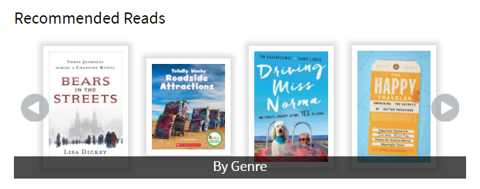
The Recommended Reads widget takes records selected from your ILS and presents them to patrons in the form of a scrollable carousel, where clicking an item will link to that item in the catalog.
Recommended Reads widgets feature a link to a menu of additional carousels, so you can create multiple carousels within the one widget, each featuring a different record set, for example with different genres or different formats.
Introduction text - (optional) Add some text to appear at the top of the widget.
More text - Set the text to appear in the black bar at the bottom of the wideget which will link to any other record sets within the widget.
Books per screen - Set the number of items to appear on one screen within the carousel. The carousel is scrollable, so this does not limit the actual number of titles within the carousel, just those that are visible at one time.
The next steps will vary depending on who your ILS is provided by...
N.B. You will need to go into the ILS and create record sets. Each record set is a collection of individual items, and will have a unique numerical ID to identify it.
Add record set - Use this button to add a new record set to the widget. Each record set will create a different carousel that will be accessible from the bottom menu of the widget.
Title - Add a title or label that describes this record set.
Polaris ID - Enter the ID for this record set from the ILS.
N.B. You will need to build up the carousels using Bibliographic IDs for the individual items that you would like to add from the catlog.
New section - Use this button to add a new section (set of records) to the widget. Each of these sections will create a different carousel that will be accessible from the bottom menu of the widget.
Section Title - Add a title or label that describes this section.
New item - Use this button to add a new item (individual record from the ILS) to the carousel.
Parent section - Select the appropriate section for this item to belong in (this will only apply if you have multiple sections).
Item name - Add a label for this record
Bib ID - Enter the Bibliographic ID for this item from the ILS
Introduction text - (optional) Add some text to appear at the top of the widget.
Order by - Choose whether to order the room booking list separated first by room, or by each event or booking.
Include patron reservations - Check the box for the listing to include room bookings made by patrons
Include staff reservations - Check the box for the listing to include room bookings made by staff
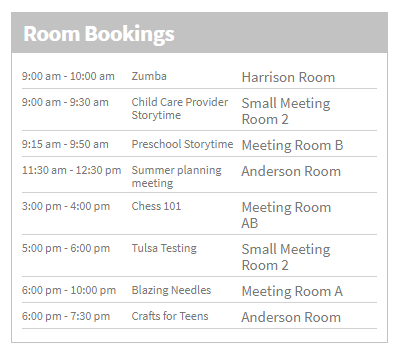
Include event reservations - Check the box for the listing to include room bookings made in connection to an Attend event or program as a venue.
Limit to rooms - (optional) Select certain rooms to which to limit this listing.
Exclude rooms - (optional) Select certain rooms to exclude from this listing.
Include private - Check the box for the listing to include private (staff only) room bookings.
Limit to types - (optional) Select certain event types to which to limit the Attend-linked listings
Limit to ages - (optional) Select certain age groups to which to limit the Attend-linked listings
Exclude types - (optional) Select certain event types for which any Attend-linked listings will be excluded.
Exclude ages - (optional) Select certain age groups for which any Attend-linked listings will be excluded.
Once you have created a widget, it can be easily added to any of your pages or shows as you build them up.
Since the widgets are stored and maintained within the Control Panel, you can use them as many times as you need, and you can remove them from the front end and they won't be lost - you can always add them back later.
The process of adding widgets is very simple whether you're building a page or a show - you will need to add a Widget block to the page or show, and use the block Settings to select the widget and make adjustments.
Widget blocks can be added from the block palette located in the menu on the right of the browser.
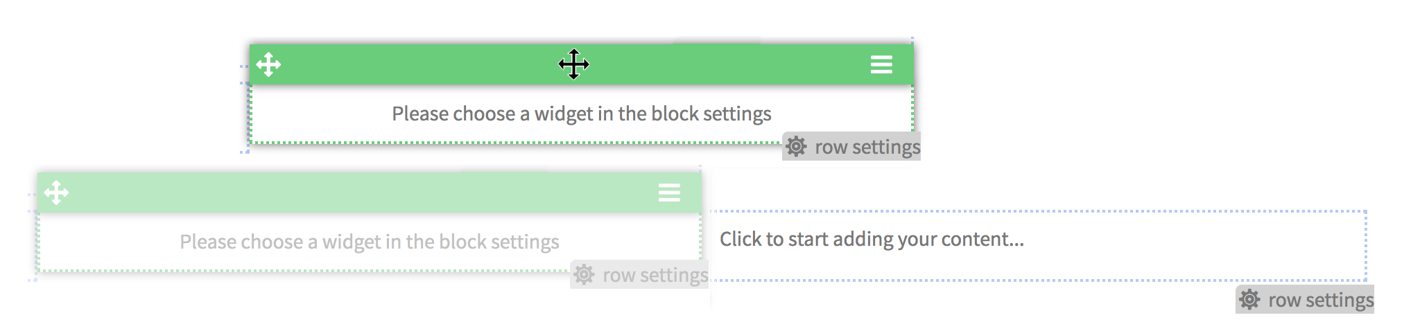
Click and drag the green widget block icon onto your page, where you want the widget to appear.
A solid black line will appear to show where the block can be positioned.
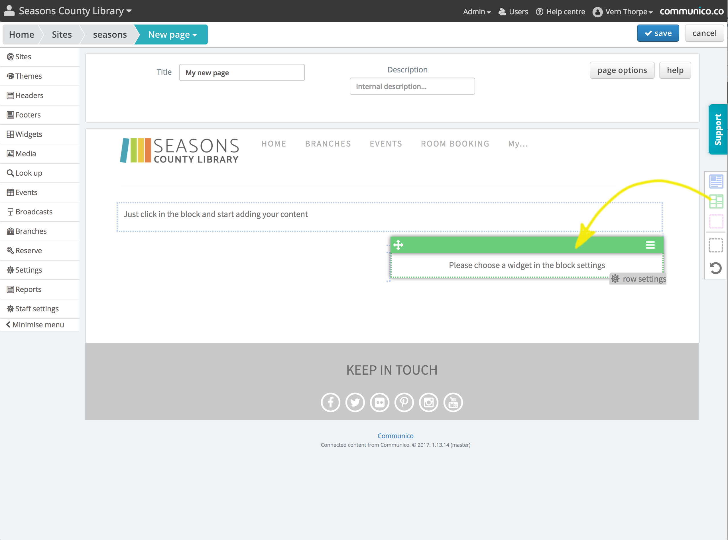
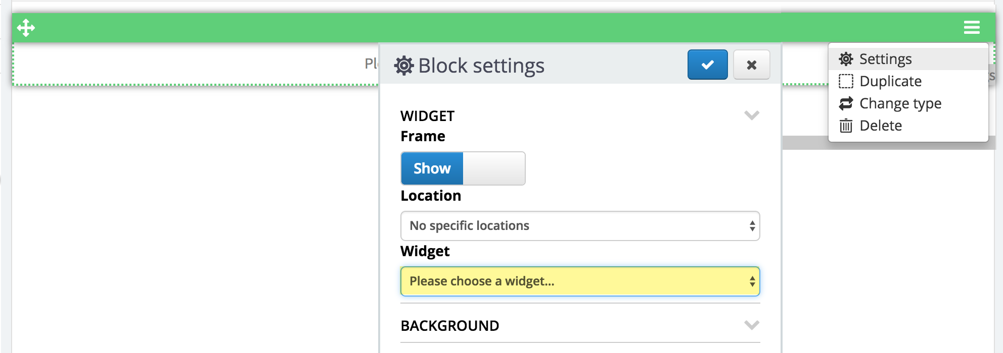
Hover over the widget block and click on the menu icon on the right of the block’s header strip.
Select Settings from the dropdown.
Under the Widget section, use the Widget dropdown to select your widget from the list of those available.
All of our widgets are fully compatible with our Sites module.
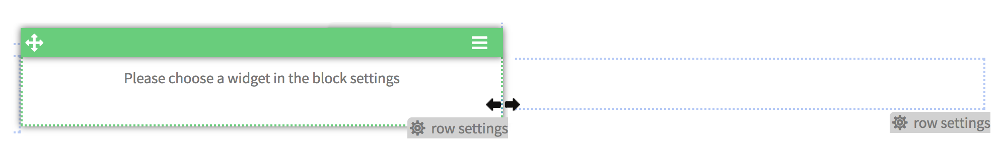
Drag the green header bar of the content block and then release it in the new position.
A solid black line will appear whenever you hover over a position where the block can be placed, so use this as a guide.
Hover over the right edge of a widget block and if it can be resized a double arrow will appear.
Click and drag to your desired width and the block will snap to the closest grid position that fits.
When you add widgets to your pages, they will take on the styles that have been set in the theme for your site. You can use the block settings to add spacing and effects, and overwrite background colors and borders.
Hover over the widget block and click on the menu icon on the right of the blocks header strip.
Select Settings from the dropdown.
You can define custom settings for individual widget blocks, changing the way the widget looks.
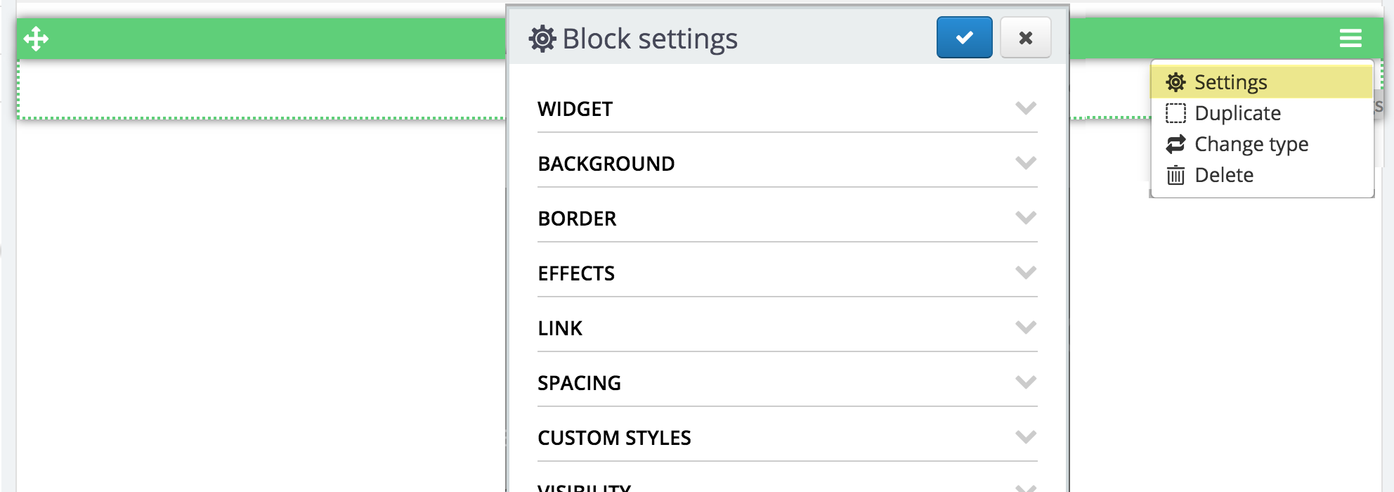
Frame - Select whether to show or hide the frame with the widget name
Widget - Select your chosen widget from the dropdown list
Location - If this widget displays information specific to a particular library location, select that location from the dropdown list
Color - Select a background color for the block
Background image - Upload or select a background image for the block
Background size - Set the size of your background image. Stretch to fit, cover, contain or no sizing.
Background repeat - Set the repeat pattern if your background image repeats. Repeat will tile the area, or you can select repeat x which will repeat the image in a horizontal row, or repeat y which will repeat the image in a vertical column.
Color - Select a border color for the block
Width - Set a width for the entire border
Top - Set a width for the top border only
Left - Set a width for the left border only
Bottom - Set a width for the bottom border only
Right - Set a width for the right border only
Style - Choose a line style for the border. It can be solid, dotted or dashed
Radius - Set how much to round the corners of the block
Shadow offset x - Set how far left or right to offset the shadow
Shadow offset y - Set how far up or down to offset the shadow
Shadow size - Set how sharp or diffuse to make the shadow
Shadow spread - Set how wide to spread the shadow
Shadow color - Select the color of the shadow
Shadow opacity - Set the opacity of the shadow
Link URL - Enter a URL here to turn the entire block into a link
Padding - Set the amount of empty padding to appear around your content inside the block
Padding top - Set the amount of padding above your content
Padding left - Set the amount of padding to the left of your content
Padding bottom - Set the amount of padding below your content
Padding right - Set the amount of padding to the right of your content
Margin - Set the amount of empty margin to appear around the outside of the block
Margin top - Set the amount of margin above the block
Margin left - Set the amount of margin to the left of the block
Margin bottom - Set the amount of margin below the block
Margin right - Set the amount of margin to the right of the block
Custom styles - Select one of your listed custom styles to apply to the block
You can choose to hide this block on screens of a certain size, by switching the toggle to hide for mobiles, tablets, small desktops or large desktops.
Hover state - Toggle to enable hover states, then you can build up another version of the block to appear on hover. To build up multiple states, switch between the normal and hover tabs on the blue header strip, visible when you hover over the block.
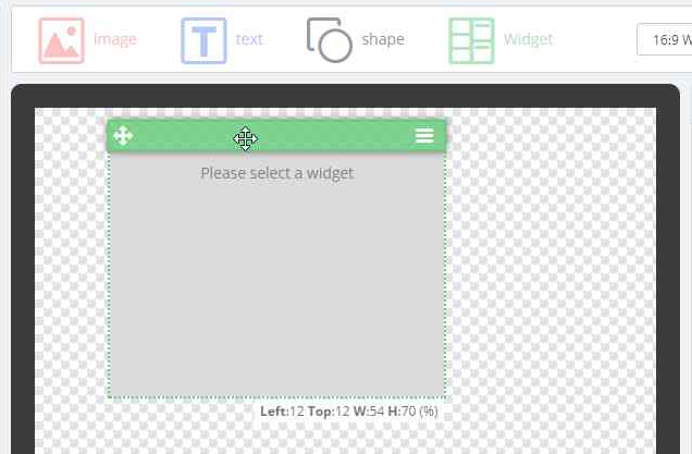
Widget blocks can be added from the block palette located above the scene area.
Click and drag the green widget block icon onto the scene, where you want the widget to appear.
Adding this new element will add a new layer to the scene, which you will see in the layers palette.
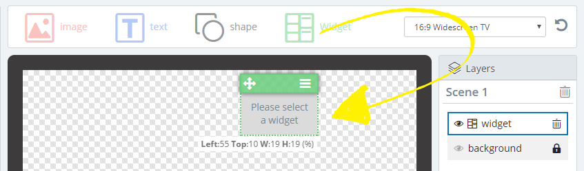
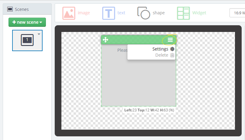
Hover over the element to reveal the header strip. Click the menu icon, and select Settings from the dropdown.
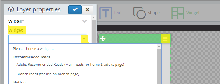
Under the Widget section, use the Widget dropdown to select your widget from the list of those available.
Simply click on the widget element, drag and release to move it around the scene.
You can also set the position precisely within Settings. Find out more here.
Under the Layers panel, you can also drag the layers up or down to change which lie on top or below.
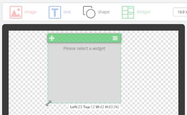
Simply click and drag the edge or corner of the element to resize.
You can also set the size precisely under Settings. Find out more here.
When you add widgets to your shows, they will take on the styles that have been set in the theme for your site. You can use the block settings to add spacing and effects, and overwrite background colors and borders.
Hover over the widget block and click on the menu icon on the right of the blocks header strip.
Select Settings from the dropdown.
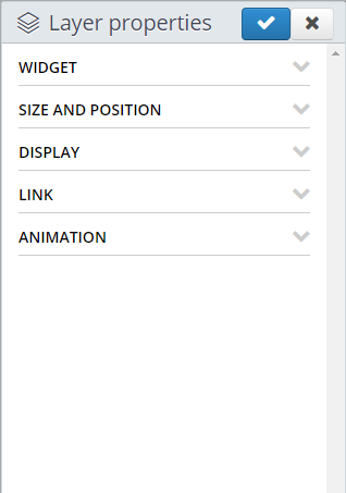
You can define custom settings for individual widget blocks, changing the way the widget looks.
Widget - Select your chosen widget from the dropdown list
Location - If this widget displays information specific to a particular library location, select that location from the dropdown list
Frame & title - Select whether to show or hide the frame with the widget name
Heading color - Choose a new color for your widget heading, other than the default white.
Subheading color - Choose a new color for your widget subheading, other than the default white.
Text color - Choose a new color for your widget text, other than the default white.
Width - Set the width of the widget as a percentage of the total scene width.
Height - Set the height of the widget as a percentage of the total scene height.
Top - Set the position of the top of the widget as a percentage of the total scene height.
Left - Set the position of the leftmost edge of the widget as a percentage of the total scene width.
Layer opacity - Set the opacity of the widget from 0 to 100%
Link URL - Enter a URL here to turn the entire block into a link
Duration (secs) - Set the duration in seconds for the widget to show on the scene. The duration of the elements within the scene will determine the duration the scene is displayed before moving on.
Delay (secs) - Set the delay in seconds before this element will appear.
In animation - Select an optional transition animation for when the element appears.
Out animation - Select an optional transition animation for when the element disappears.
Animation duration (secs) - Set the duration for the transition animation, if you have chosen one.


